2021. 7. 25. 17:23ㆍmadquer/Feed

From Prediction to Action — How to Learn Optimal Policies From Data (Part 1)
In data science work, we build models to make predictions. And using these predictions, we make decisions or take action.
towardsdatascience.com
From Prediction to Action - How to learn optimal policies from data
part 1. The problem definition
part 2. Create a dataset
part 3. Estimate the outcome of any policy
part 4. Find an optimal policy
----------------------------------------------------------------------------------------------------------------
https://towardsdatascience.com/sentiment-engagement-analysis-from-your-slack-data-11f7ff995b62
Sentiment & Engagement Analysis from your Slack data
A sneak peek into your Slack space’s emotions
towardsdatascience.com
Slack API 를 사용해서 할 수 있다는 것만 추출
----------------------------------------------------------------------------------------------------------------
https://towardsdatascience.com/studying-up-for-the-tokyo-2021-olympics-with-sql-719a0ae3779b
Studying up for the Tokyo 2021 Olympics with SQL
Querying a PostgreSQL Database with Python, displaying results with Pandas, and visualizing with Matplotlib
towardsdatascience.com
올림픽엔 큰 관심없지만, 데이터가 올라왔다는 정도. 이런것도 하구나 정도.
----------------------------------------------------------------------------------------------------------------
PCA: Principal Component Analysis — How to Get Superior Results with Fewer Dimensions?
One of The Best Techniques for Dimensionality Reduction
towardsdatascience.com
Machine Learning interactive chart 가 매우 대단하다.
추가로 이러한 사이트를 발견
Saul Dobilas – Medium
Read writing from Saul Dobilas on Medium. Data Science and Analytics Professional. Writing about Machine Learning and Data visualization. | Twitter: @solclover | www.linkedin.com/in/saulius-dobilas.
solclover.com
interactive chart 는 matplotlib.plotly 로 구성됨.

PCA : 각 후속 차원에서 최대 분산량을 캡쳐할 수 있는 방식으로 데이터를 변환
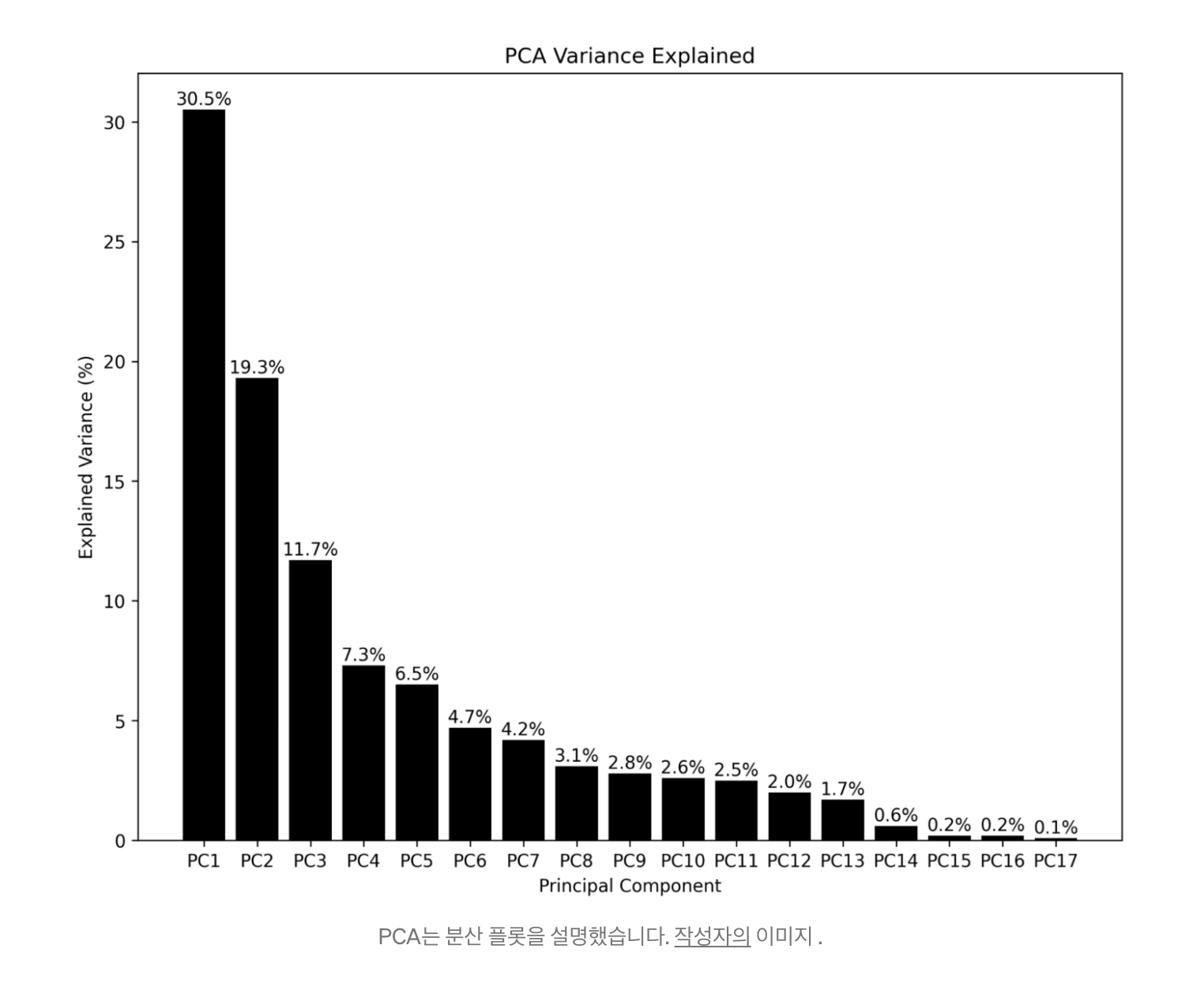
PCA 에 대한 간략한 설명과 멋진 interactive chart 가 좋았어.
----------------------------------------------------------------------------------------------------------------
Develop an Interactive UI for a Microservice using Streamlit
Turn your python microservice to an interactive dashboard instantly
towardsdatascience.com
frontend prototype 까지도 파이썬으로 모두 가능하겠네
Streamlit • The fastest way to build and share data apps
Streamlit is an open-source app framework for Machine Learning and Data Science teams. Create beautiful data apps in hours, not weeks. All in pure Python. All for free.
streamlit.io
----------------------------------------------------------------------------------------------------------------
'madquer > Feed' 카테고리의 다른 글
| [Feed] 2021.08.01 (0) | 2021.08.01 |
|---|---|
| [Feed] 2021.07.26 (0) | 2021.07.26 |
| [Feed] 2021.07.20 (0) | 2021.07.20 |
| [Feed] 2021.07.19 (0) | 2021.07.19 |
| [Feed] 2021.07.18 tds and etc (0) | 2021.07.18 |